I’ve recently been playing with congressional staff salary data and decided to display some trends graphically. Many observers have noted recently the troubling decline in the number of staffers in Congress — which is problematic if you’re interested in, for example, reforming lobbying or bolstering Congress’ oversight capacity. There’s also some excellent recent academic work systematically analyzing the impact staff have on the policy making process by Jacob Montgomery and Brendan Nyhan (ungated here).
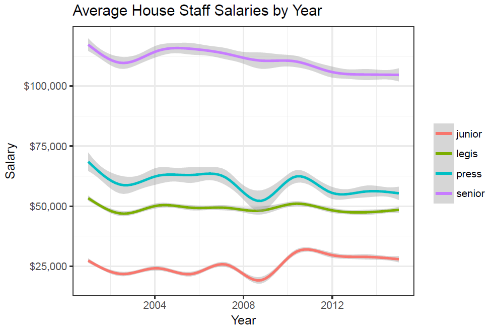
This first graph depicts average salaries overtime by binned job title (salaries are adjusted for inflation):
This one graphs some of the more common job titles over time:
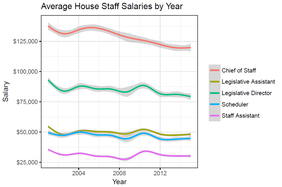
There are in fact some downward trends, particularly in the more senior levels of congressional staffers. However, the junior levels have remained largely constant. But the larger point here is these should be increasing. DC is an incredibly expensive place to live (I know–I spent three years working there); the number of staffers are decreasing on average, meaning the same people are taking on more responsibilities; and we should be interested in supplying these public employees with a wage at least in the same ballpark as what they would make in the private sector. Just look at the Legislative Assistant salaries in the second graph — these people do a bulk of the day-to-day policy work and are barely making $50k. Adjusting for cost of living, that’s closer to $35-40k here in Atlanta.
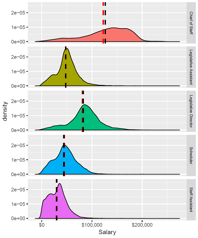
Edit: here are the salary densities. The red dashed line is the mean, the black dashed line the median (click for a larger image).
All figures were created in R using ggplot2.